WP Ultimate Tours Builder
This plugin is an unique plugin that allows you to easily create beautiful, smart and powerful visual tours on your Wordpress website. By Loopus
If you have any questions that are beyond the scope of this help file, please feel free to email via my user page contact form here.
| Author: | Loopus |
| Contact: | support@loopus-plugins.com |
| Author URL: | https://www.loopus-plugins.com |
| Item URL: | http://codecanyon.net/user/loopus |
Installation How to Install the plugin
1. Install Plugin
Here's a brief information about how to install this plugin
Simply upload the file "WP_UltimateToursBuilder.zip" from the plugins panel of Wordpress then activate it clicking the link "Activate" under the name of the plugin.
Usage How to use this plugin
2. Use the plugin
Here's a brief information about how to use this plugin
Click on "Tours builder" menu link to open the tours list panel :
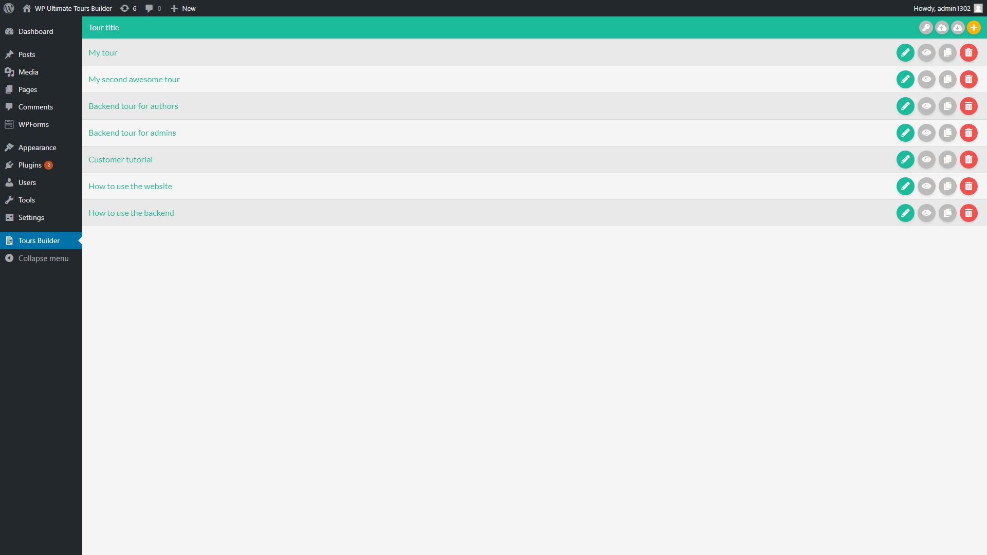
From this panel, you can create, edit, duplicate, delete, import and export your tours.
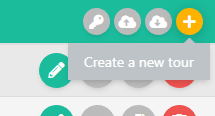
Simply click the button "+" in the plugin header bar to create a new tour .
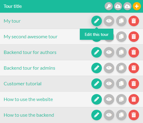
To edit an existing tour, simply click the pencil icon displayed in the row of the target tour :
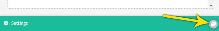
Once on the tour panel, simply click the "maximize" icon of the "Settings" panel to open the settings of the tour :
From the "Settings" tab of this panel, you can manage the global settings of the tour :
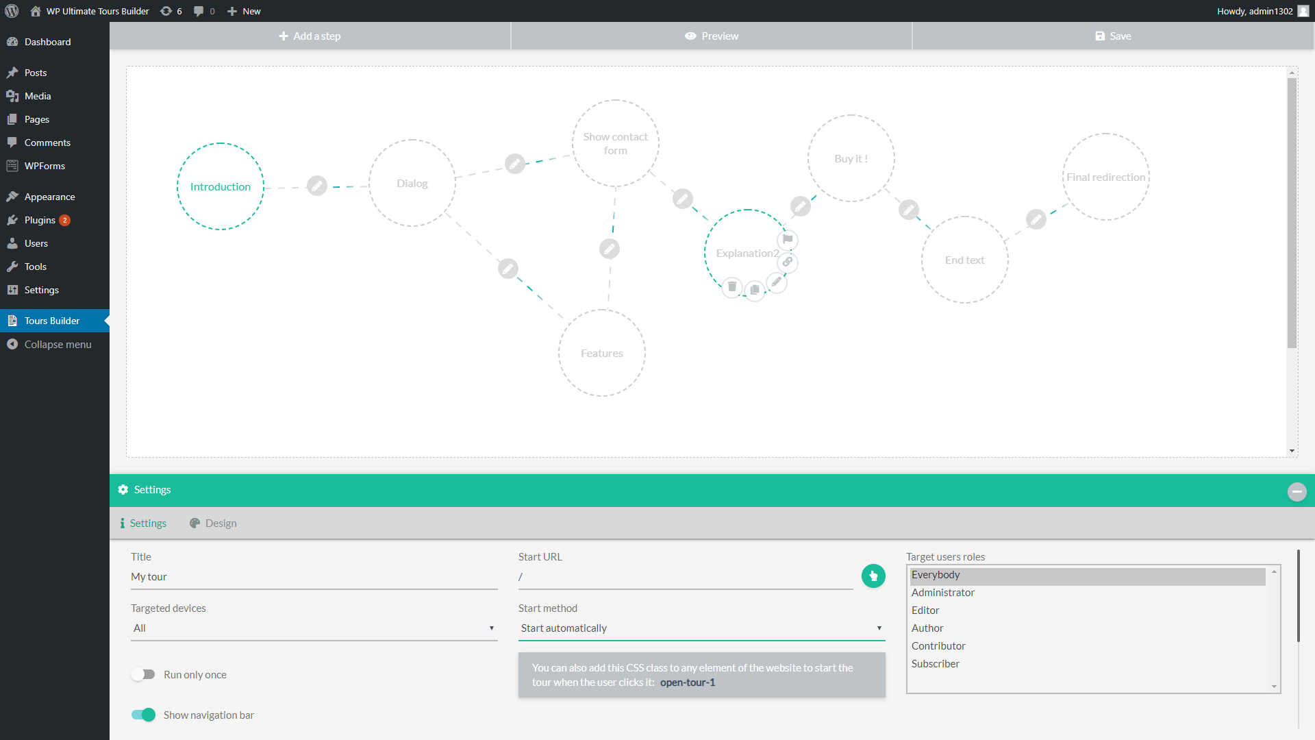
Here are the options of the tour settings tab :
- Title : The title of the tour. This name is only used on the backend side, to allow you to easily recognize your different tours.
- Targeted devices : This option allows you to choose if the tour must be shown on all devices, only mobiles or only computers & tablets.
-
Run only once :
If this option is activated, the tour will be displayed only one time for each user.
The plugin uses the browser local storage to detect if the user already seen the tour or not. - Show navigation bar : If this option is activated, a navigation bar will be displayed during the tour. It allows the user to navigate between the steps of the tours or stop it at any moment.
-
Start URL :
This option allows you to define the pge from where the tour will be launched.
You can click the pointer icon near the field to visually select the target page . - Start method : This option allows you to choose if the tour must start automatically or only when the user clicks a specific element of the website.
-
Target element CSS selector :
If you choose to start the tour when an element is clicked, this option will be displayed to allow you to define the target element.
You can dirctly fill the css selector of the target (ex: #myButtonID) or click the pointe icon to visually select the target element. - Target users roles : From this option, you can select the user roles that will be allowed to see the current tour.
From the "Design" tab of this panel, you can manage the design settings of the tour :
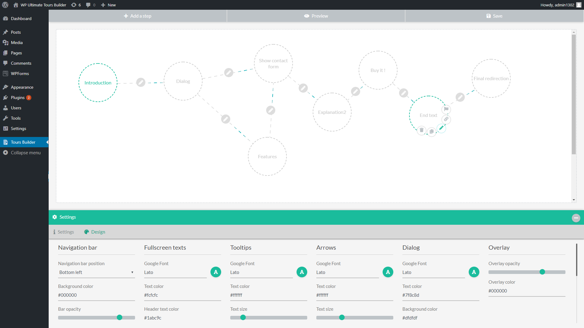
These style settings define the default step settings when a new step is created.
You can change the font and colors of each element types and of the overlay .
Click the button "Add a step" in the top menu to create a new step :

It will add a step circle in the steps manager panel.
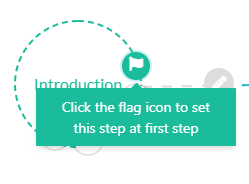
You need to click the flag icon on the step from where you want to start the tour.
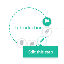
Simply click its pencil icon to edit this step :
The left side of the step panel shows the visual preview of the step, and the right side contains the settings of the step :
Settings
The "Settings" tab contains the main settings of the step :
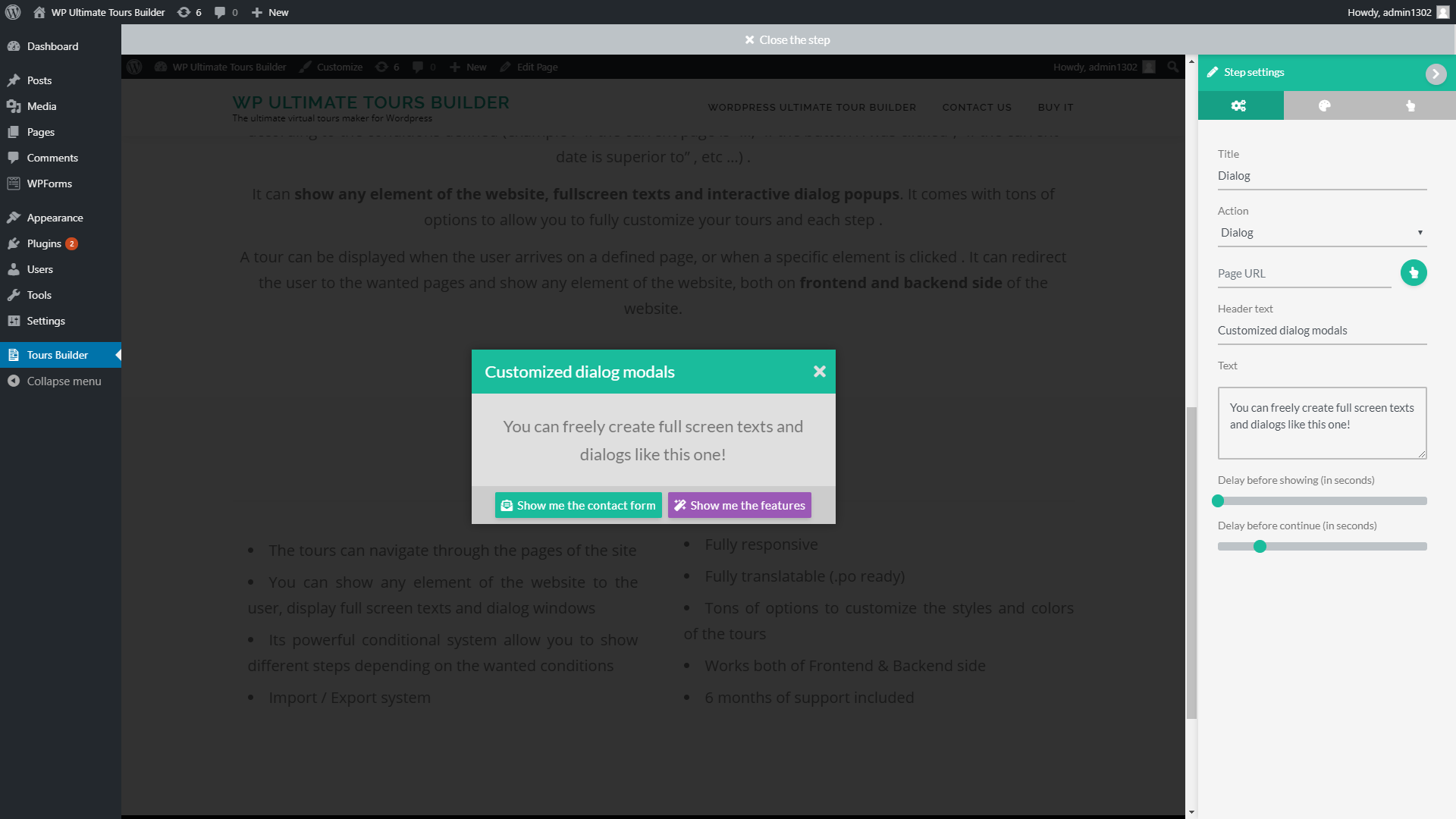
Here are the options of the step settings tab :
- Title : This title is only used on the backend side, to allow you to correctly manage your steps
-
Action :
This option allows you to define the type of action executed by this step :
- Dialog : It shows a dialog modal whose contents and buttons you can freely configure.
- Execute JS code : This action allows you to execute your own JS code when this step is called
- Fullscreen text : It shows a custom text in fullscreen
- Redirection : This action allows you to redirect the user to the wanted page of the website
- Show an element : This action allows you to visually show any element of the website
- Page URL : This option allows you to define the page where the current step will be executed
- Header text / Text : These options allow you to fill the different texts of the step
- Delay before showing (in seconds) : This option defines the delay before the step displaying
- Delay before continue (in seconds) : This option defines the delay before calling the next step
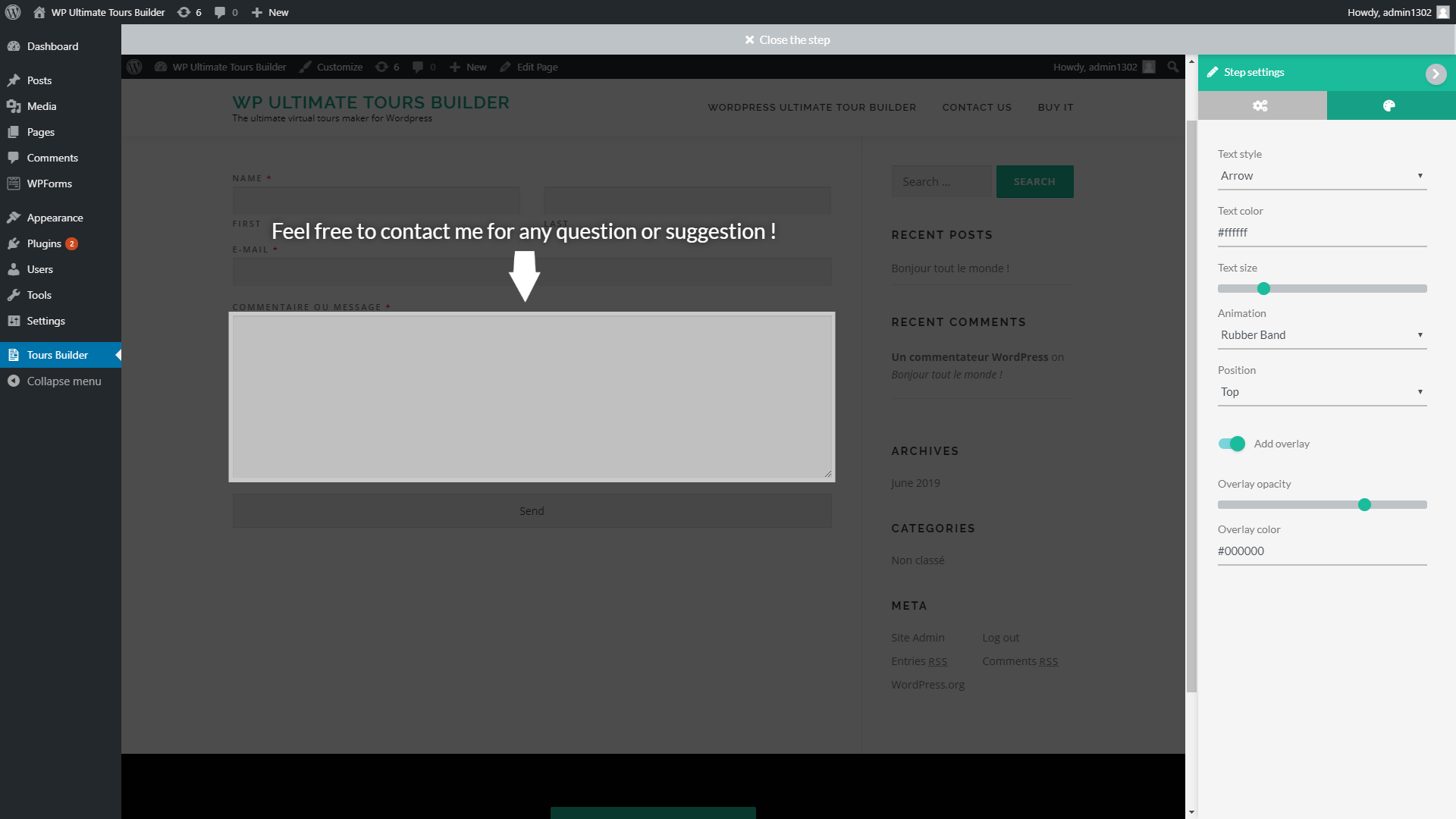
Styles
The "Styles" tab contains the main design settings of the step :
Buttons
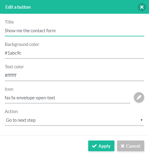
The "Buttons" tab is only displayed when the "Action" option of the step is set to "Dialog" :
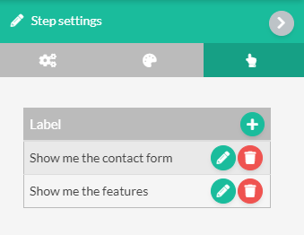
From this panel, you can create, edit and remove the buttons of the dialog modal.
Simply click the pencil icon on a button row to edit this button :
Once the steps created, you need to link them to allow the plugin to show them successively and conditionally show/hide the wanted ones.
Move the mouse cursor over a step and click its button "Start a link" to create a new link that starts from this step :
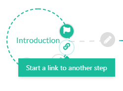
Then click the target step to finish the link creation.
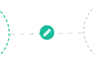
Each step can be linked to several other steps, and you can define different conditions on each one by clicking the "pencil" icon on the link.
It will open the link condition panel :
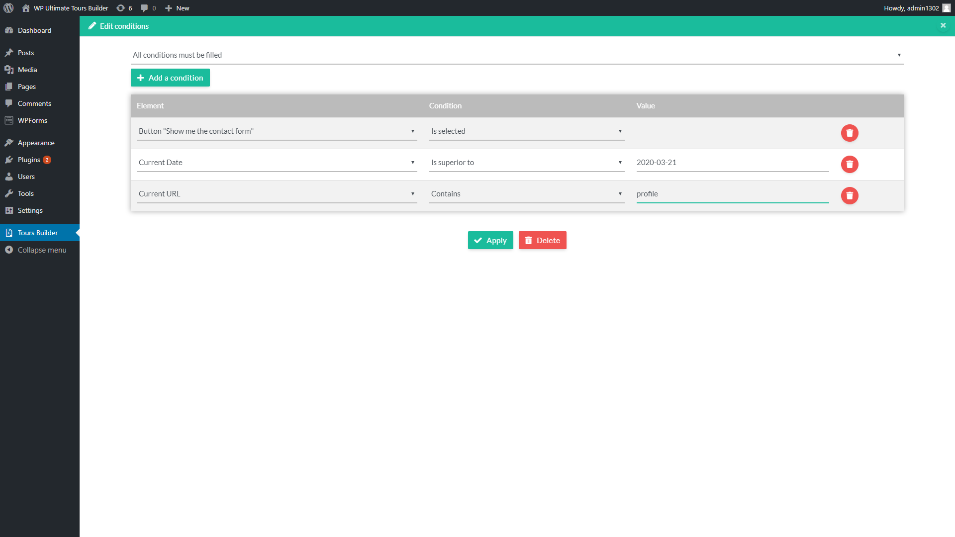
You can create new conditions by clicking the button "Add a condition", then edit it from the conditions table.
The current link will be used by the plugin only if the defined conditions are filled.
You can preview the current tour at any time without applying the modifications done to the published tour, simply by clicking the "Preview" button of the top menu :

To apply the modifications done to the published tour, you need to click the "Save" button of the top menu :